Visualizing big data
I was trying to visualize a roughly seven thousand operation compiler IR
trace to get a feeling for how I might optimize it. I tried throwing
it into Graphviz and after waiting for 15 minutes, I killed the dot process.
The @Graphviz Twitter account recommended trying the sfdp tool, so I gave
that a go. It terminated fairly quickly but I could not make much out of the
mess:

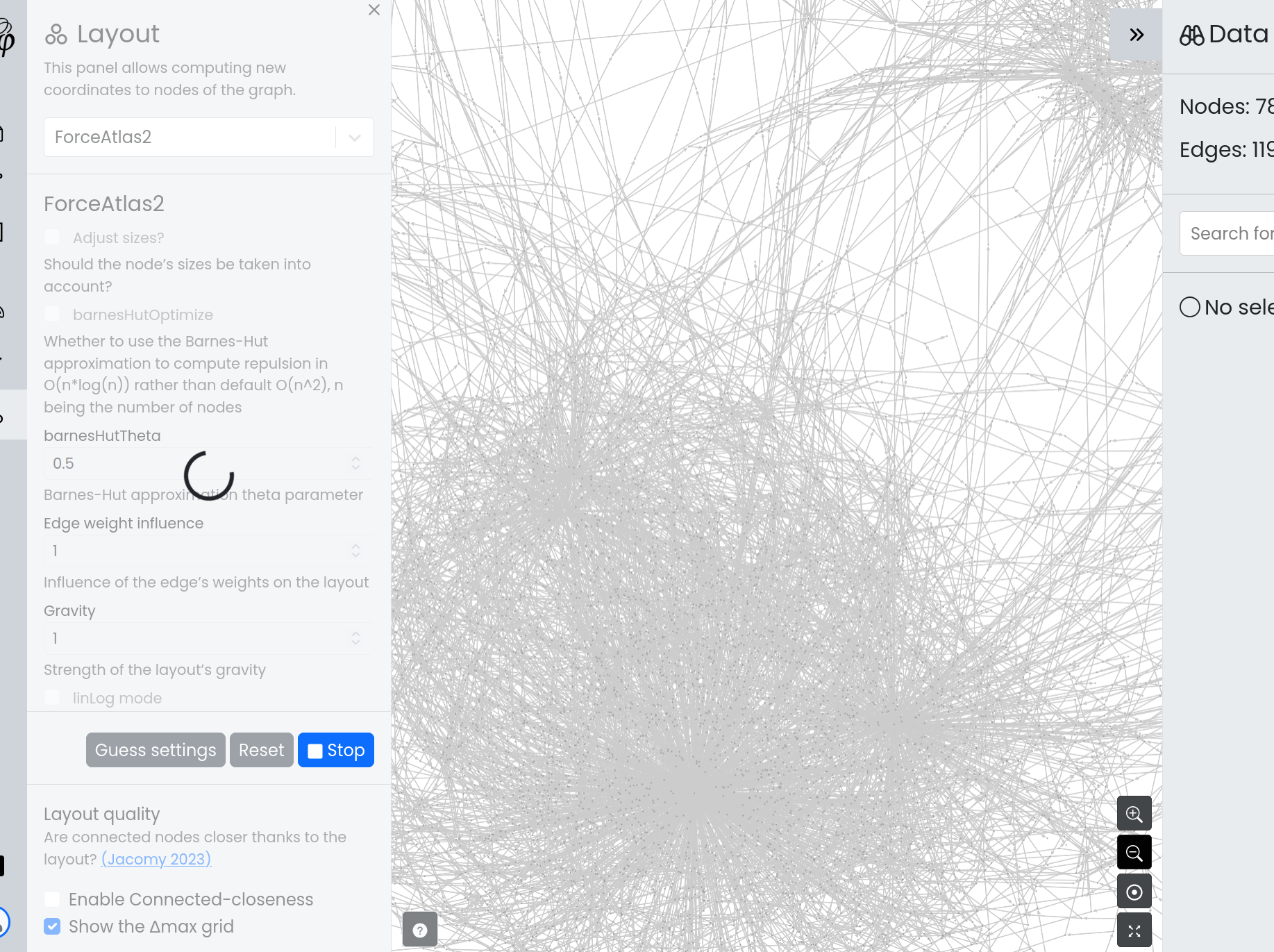
They also recommended Gephi ForceAtlas2, so I gave that a go.
Anyway, while Matt Keeter’s project is very interesting, my several hour interpreter foray into it is not. This all reminded me, though, of a time many years ago when I was working as an intern for a transportation service.
A scheduler
This transportation service had a bunch of Very Important Database Queries that had to periodically run or Bad Things would happen. As I remember it, they couldn’t do all of them with cron because the big batch jobs were very resource intensive, had differing priorities, had unpredictable run time, and some could not run concurrently with others. So there was some kind of wild ad-hoc rotation of people getting up at odd hours of the night HQ time and manually running the jobs when fewer people were using the ETL cluster.
I got tasked, kind of accidentally, with fixing this, so after much deliberation, I went off and wrote the world’s worst scheduler. The goal was to schedule something like twenty thousand jobs per week (the small jobs and the Big Ones).
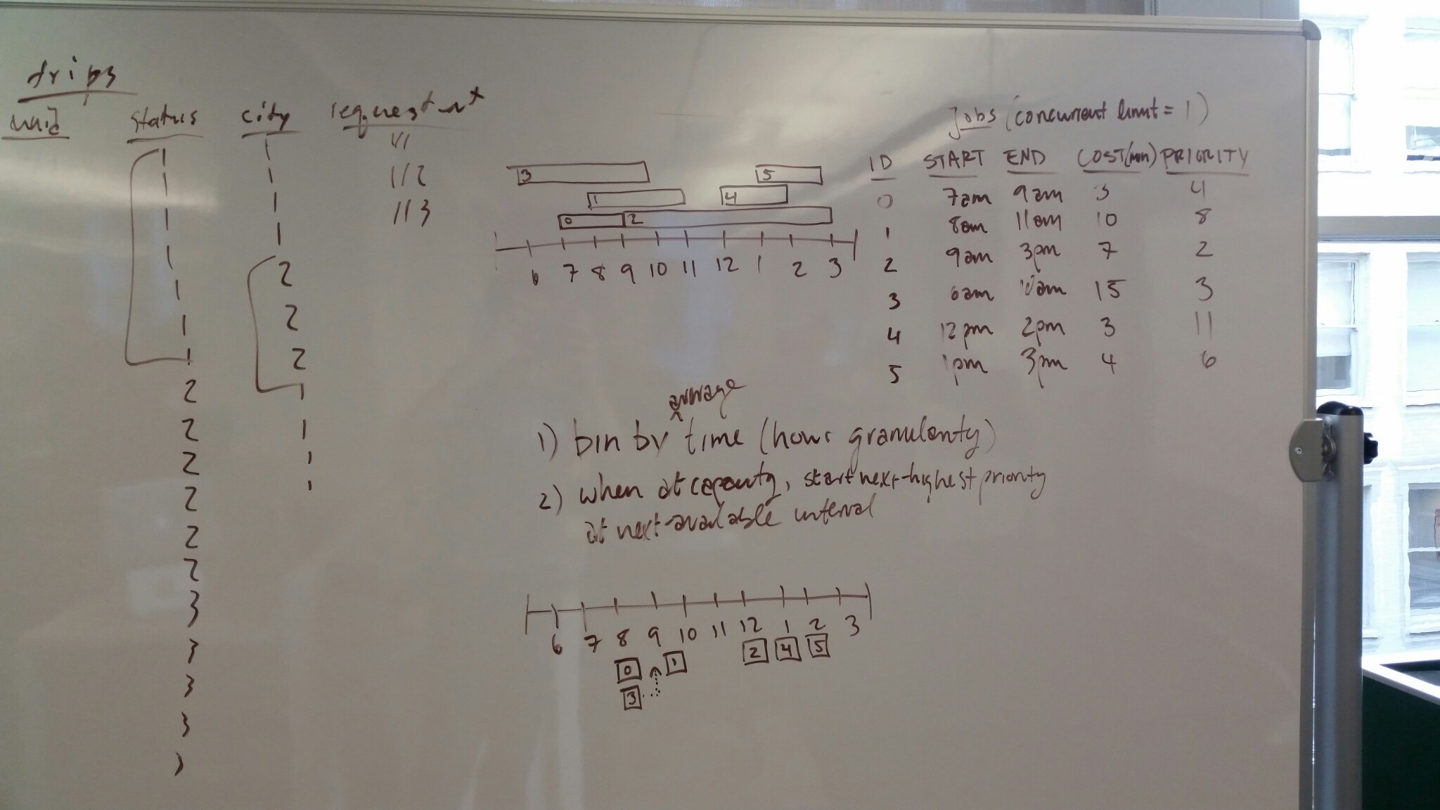
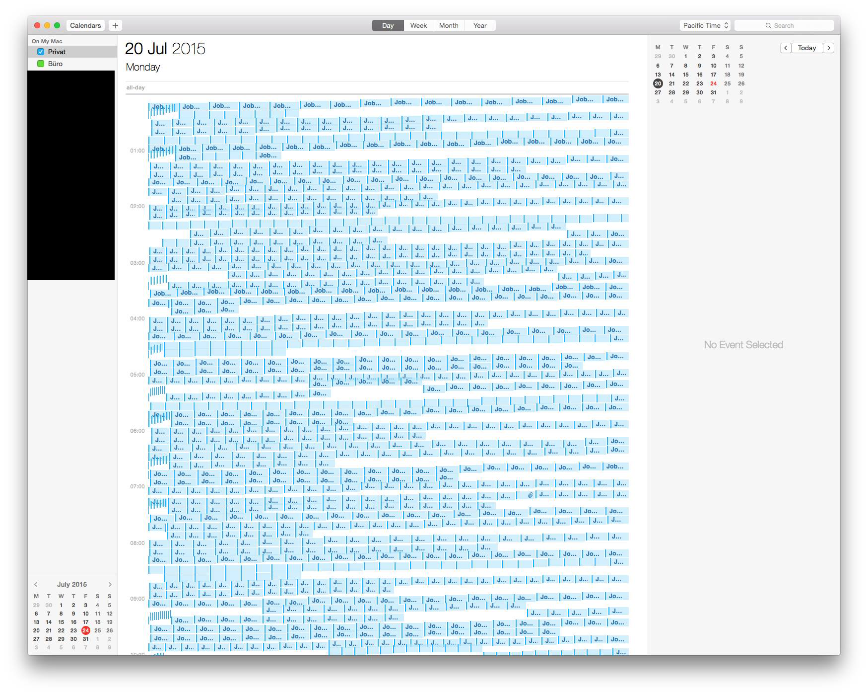
After writing a scheduler, I didn’t really know what to do. I generated some sample jobs with different priorities, resource constraints, and time estimations based on fake historical data. I fed it into the scheduler. It output a big text file. I did not have a good intuition for how well it was doing. So I tried to visualize it.
I did not find any good scheduler visualization tools. Then I remembered I had a calendar application. I learned that the ical format is a pretty straightforward open text format, so I had my scheduler generate ical files. They look like this (example Bastille Day event from Wikipedia):
BEGIN:VCALENDAR
VERSION:2.0
PRODID:-//hacksw/handcal//NONSGML v1.0//EN
BEGIN:VEVENT
UID:uid1@example.com
ORGANIZER;CN=John Doe:MAILTO:john.doe@example.com
DTSTAMP:19970701T100000Z
DTSTART:19970714T170000Z
DTEND:19970715T040000Z
SUMMARY:Bastille Day Party
GEO:48.85299;2.36885
END:VEVENT
END:VCALENDAR
Amazingly, it worked. Apple Calendar handled it magnificently:
I think the only problem was deleting the events. I could not figure out a way to do that at all.
Also, the scheduler never made it into production. Someone else made something
more usable after I went back to school. Ah well. I think my lasting
contribution from that summer was a patch to the pyodbc
project to add a Connection.closed property. That
adventure started with the first PR in July of 2015 and ended six years later
in 2021 when I made a new PR that finally got merged.
The end
I don’t have any meaningful lessons from this other than visualization is hard and a skill on its own.